
How farm data integration could improve N use efficiency
 © Tim Scrivener
 Collating and analysing data from multiple different farm machinery and other sources in a single place has long been a bugbear for many farmers.
Accurate in-field analysis is only practical and possible with complete farm data integration, claims Jim Williams, chairman of data analytics start-up AgAnalyst. Its first product, DataBaler, is aimed at solving that issue.
See also: Farmer network trials precision farming technology
“Our mission is to make data science available to every farmer,” says Mr Williams. “Currently, the only data science farmers receive is from people trying to sell them things.”
Farmers should be the principal beneficiaries of the data from their fields, soil tests, farm machinery and farming operations, he says.
“Using that data with pinpoint accuracy will help them, with their advisers, to manage the yield and quality variability across every field.”
‘Liberating’ farm data
“But it is difficult to achieve, as the data from drilling, spreading, spraying and harvesting is rarely compatible, and needs considerable time and effort to layer together,” he adds.
Some machinery manufacturers, such as John Deere, have developed data platforms that start to bring field data together using open APIs, but Mr Williams suggests even then, the last 20% of data is frequently still not integrated.
There is also a hidden price – the manufacturer gets to see all your data.
“Most farmers are happy to share relevant date with equipment manufacturers to help run the machines more effectively, but are less keen for one vendor or input manufacturer to see the entirety of their data,” he says.
“With DataBaler we’ve made it easy to liberate farm data and only share it with those the farmer trusts.”
The platform takes raw data files from fields and farming operations, such as yield data from combines, shape files loaded as prescription plans into spreaders or sprayers, or as-applied data from an isobus controller or an N-sensor.
“We’re machine agnostic,” Mr Williams insists.
© Tim Scrivener
Importing data
Importing the data is reasonably straightforward, he adds. “The real difficulty is in removing the outliers and noise in the data.”
There are many potential errors to be aware of, says Clive Blacker, farmer and AgAnalyst head of agronomy and precision technology.
For example, GPS errors, lags or surges in grain going through the combine and inaccurate sensor calibration can all cause errors in yield map data.
AgAnalyst has developed various processes within DataBaler to clean data to make it accurate and usable.
It also standardises the data so it’s directly comparable – for example, from two different makes of combine.
The result is that data that can be interrogated with pinpoint accuracy, Mr Williams says, to help optimise farm operations.
Even so, it is easy to be overwhelmed by data, so AgAnalyst is building bespoke dashboards to help farmers understand their data better.
A first target is nitrogen fertiliser use. Mr Blacker has been keen to understand how to use N more efficiently on his own farm, as well as more widely in the industry.
“AHDB data suggest 83% of typical greenhouse gas emissions from arable farms come from fertilisers, so we need to use it better,” he says.
Nitrogen efficiency
Most farms achieve about 60% nitrogen use efficiency on average, a figure Mr Blacker describes as “horrifying” and which started him on a journey to provide the tools and data to help measure and improve it.
“The industry has been researching the optimum rate of nitrogen for years, but the big challenge is that we are never sure what we will get out of the soil and when it will be available.
“We’re also never quite sure what the plant demand and yield demand will be, so the optimum rate is always a bit of a guess,” he points out.
“The holy grail is to map and measure what plants need, and what is going on with nitrogen release and mineralisation, so we can make better decisions on when we apply fertiliser to achieve better use efficiency.”
Since 2018, Mr Blacker has been comparing his farm’s applied nitrogen with crop uptake calculated using yield and grain protein to get a simple measure of nitrogen fertiliser use efficiency.
Nitrogen fertiliser use efficiency (NfUE) is a comparison of inputs versus outputs, he explains, whereas nitrogen use efficiency (NUE) also accounts for the nitrogen in the soil, and assumes 100% of the nitrogen measured is taken up by the crop.
Typically that reduces efficiency by 10-20%.
On-farm trials
In the past three seasons, he has also trialled different approaches to see if he can improve his NfUE by changing rates and timings.
He also uses Yara’s N Tester as a management tool to measure what is in the crop and benchmarking that to understand what to apply.
The changes he has made, which include applying smaller amounts more regularly, have reduced overall inputs by 20%, increased yields by up to 11% and improved nitrogen fertiliser use efficiency to more than 90% compared with about 75% using his farm-standard practice.
But he would like to be able to improve further, which is where DataBaler comes in. “Before I can do proper mitigation, I need to do proper measurement.”
Using cleaned yield, grain protein analysis, fertiliser prices and, ideally, individual N application data (although it can use just average field records), the dashboard provides graphical representations and numeric summaries for different metrics on a field level.
A simple field summary provides top-line information about mean nitrogen inputs and outputs, average expenditure on nitrogen per hectare and value returned, and nitrogen fertiliser use efficiency.
If a soil mineral nitrogen analysis is available, it can be uploaded to calculate nitrogen use efficiency, Mr Blacker adds.
Nitrogen balance
Using this data it is simple to calculate a nitrogen balance – whether the value returned from nitrogen applied outweighed its cost, or if you overspent on N.
Map layers highlight different metrics using colour scales, visually bringing out the variance across a field.
Some of the map layers are possible to create in Gatekeeper, but one that is unique to DataBaler is bringing together different variable application maps from a season in a final total nitrogen applied map, Mr Blacker says.
A complicated-looking scatter point graph is used to highlight whether there is any relationship between two metrics – for example, yield and protein, or yield and first, second or total nitrogen applications.
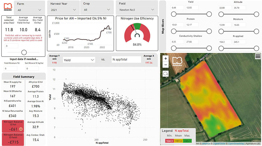
© DataBaler
You can also delve into a multi-year analysis or change some of the input metrics, such as fertiliser price, to do what-if scenario planning. Multi-year analysis might start to highlight fields where you could cut back on N use, or parts of field that consistently respond to nitrogen, for example.
The dashboard is just the beginning of the start-up’s plan for improving nitrogen use by employing data, with the ultimate aim to develop a decision support system that can help the farmer throughout the year, Mr Blacker says.
Before that can happen, there is still much to do to help farmers understand the use of their data. While understanding the DataBaler dashboard is relatively simple once explained, there is a gap in farmers’ knowledge about how to interpret and analyse data effectively, he says.
“That’s why we’re developing an AgAnalyst Academy to help upskill farmers so they have the skills to interpret data properly.”

Using contractors saves you time and money. Now you can book, track and pay all in one place. Register for early access today.